Project Overview
Lepak Corner is a comprehensive User Interface and User Experience (UI/UX) project that involved navigating the full design process, from problem ideation to crafting user personas, developing scenarios, and conducting three rounds of user testing with 7–8 participants per round. I led the UI and UX design efforts, creating majority of the screens and interactions for the project.
Problem Definition
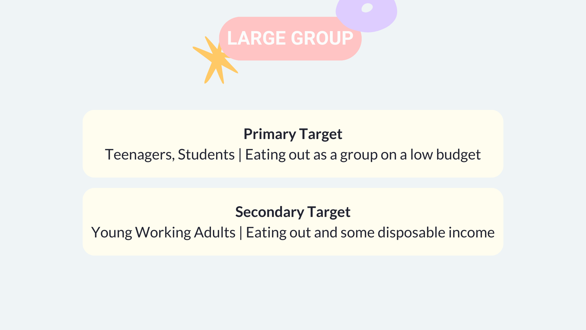
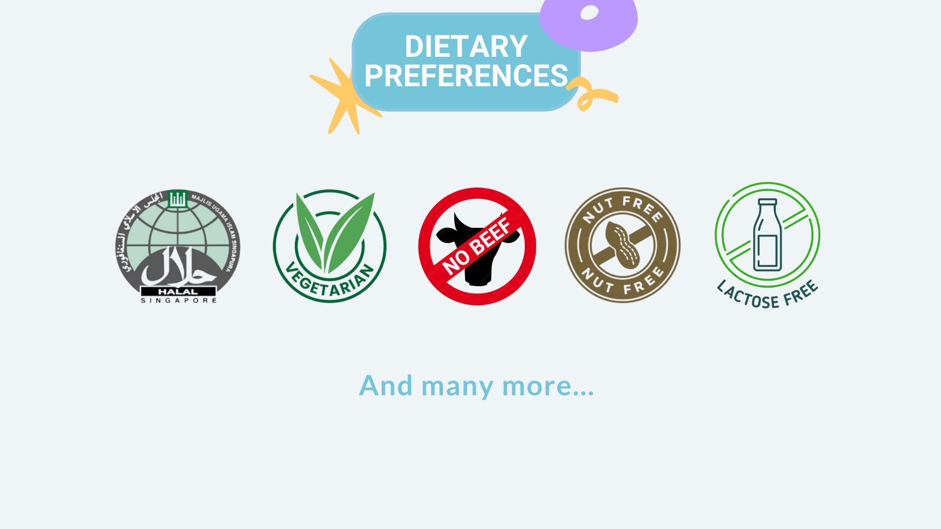
The project aims to address the challenge of organizing meals for groups of 5–10 people with diverse dietary preferences and needs. The goal was to develop a solution that helps these groups efficiently identify communal gathering places that accommodate all dietary requirements, simplifying decision-making and ensuring an enjoyable dining experience for everyone.
Definitions
To ensure clarity, the following definitions were laid out:
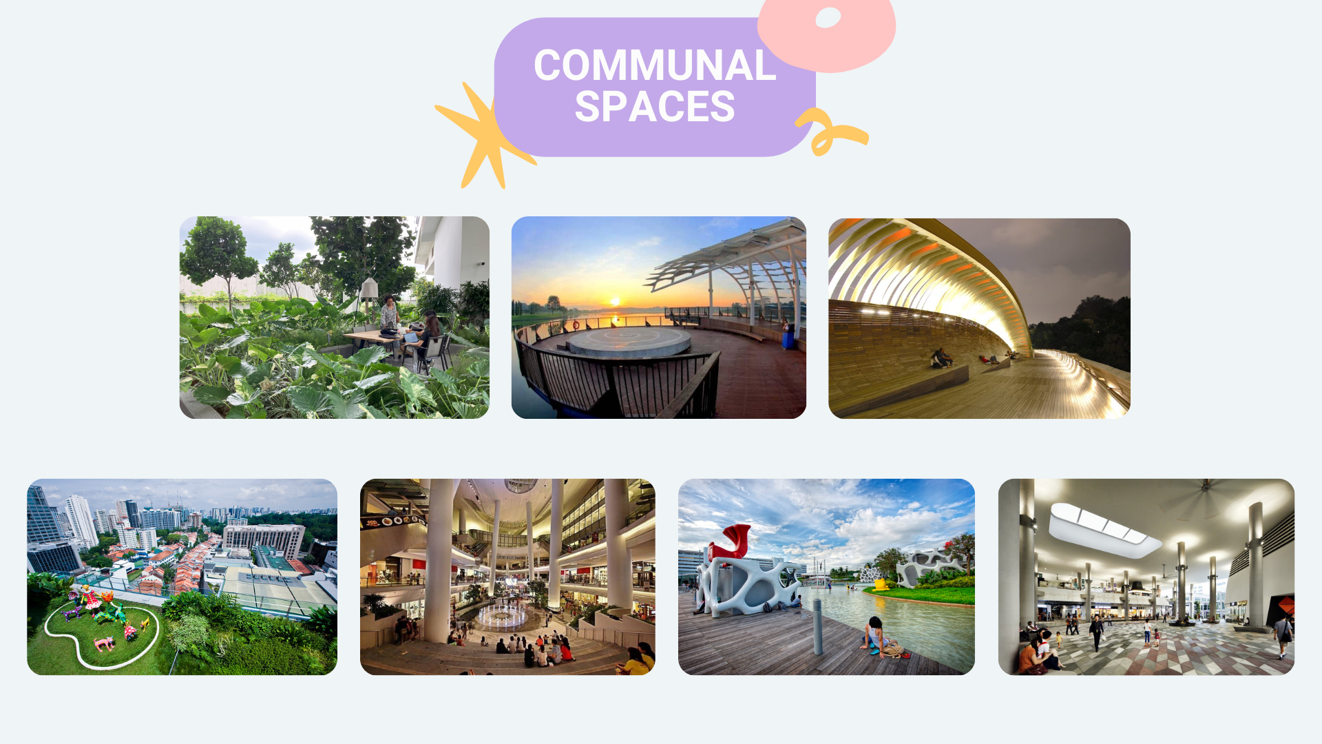
Source: Images belong to respective locations owners
Design Process
Ideation Phase
With the problem in mind, we went through several initial steps.
1. Explore Existing Solutions
2. Identify Key Features
3. Conduct initial large scale survey to identify largest pain points
Existing Solutions
We first took a look at 5 current existing solutions that provides food or location suggestions and did a quick comparison chart to see what they can and cannot do.
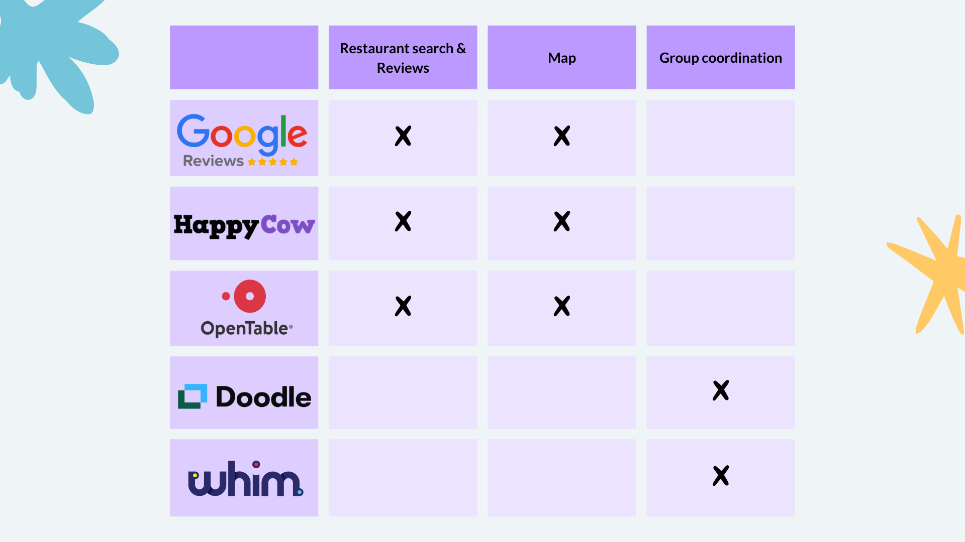
Through this, we were able to identify visible gaps in current applications.
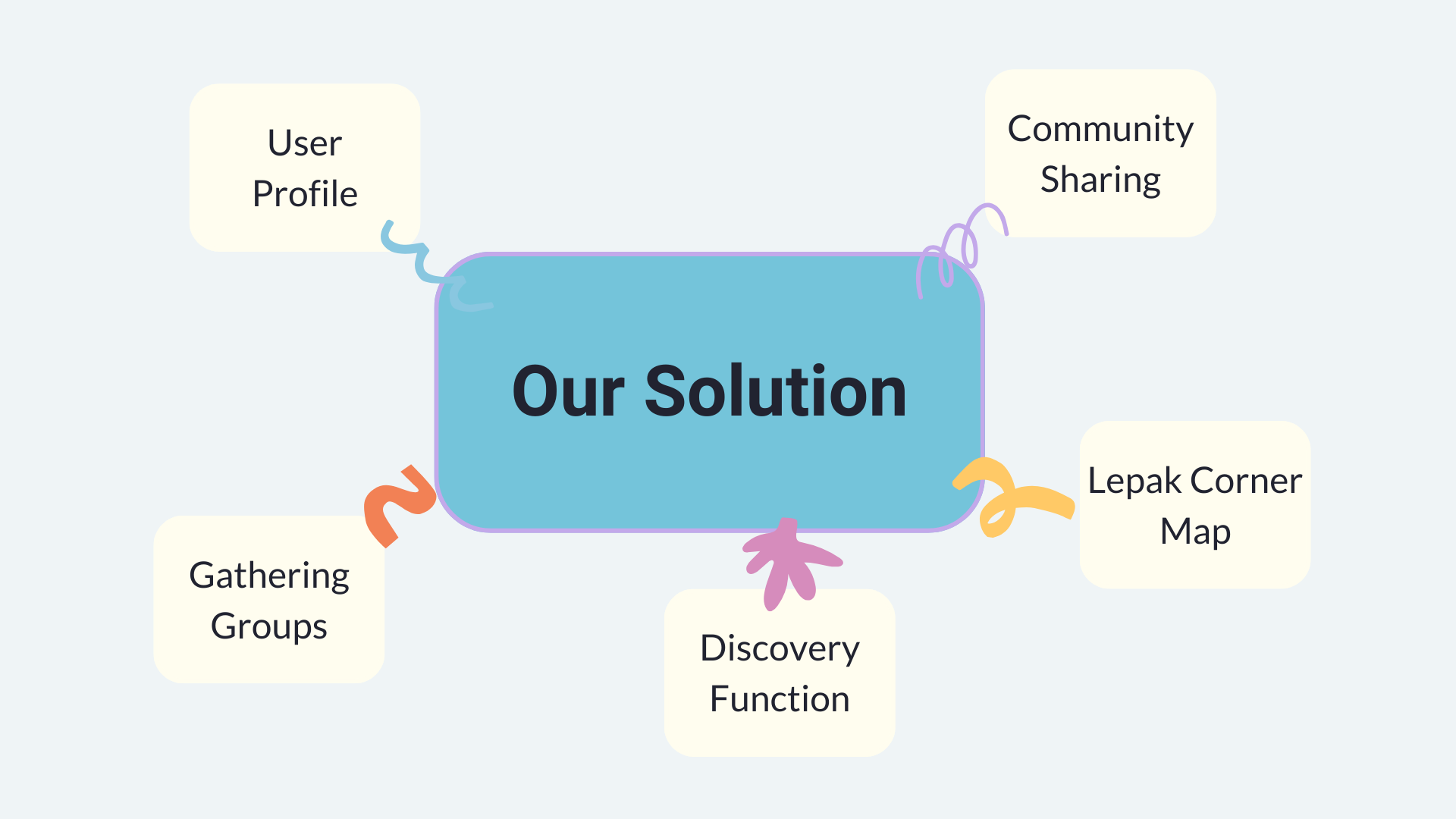
Identifying Key Features
Key features of the application were then laid out in full as shown below:
Large Scale Surveys
We then conducted a large scale survey consisting of 61 respondents To understand the needs and concerns of our target audience, refine our problem statement, and to ascertain the desirability of our application.
Questions included frequency of outings, size of outings, common problems faced in group outings and more.
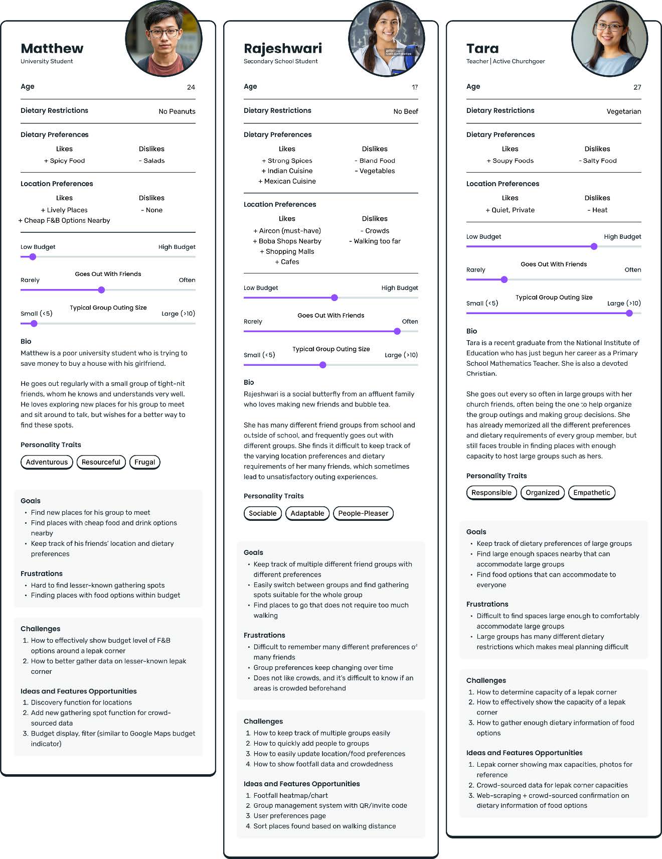
User Personas
We then worked on identifying 3 key user personas and scenarios:
Prototyping and User Testing
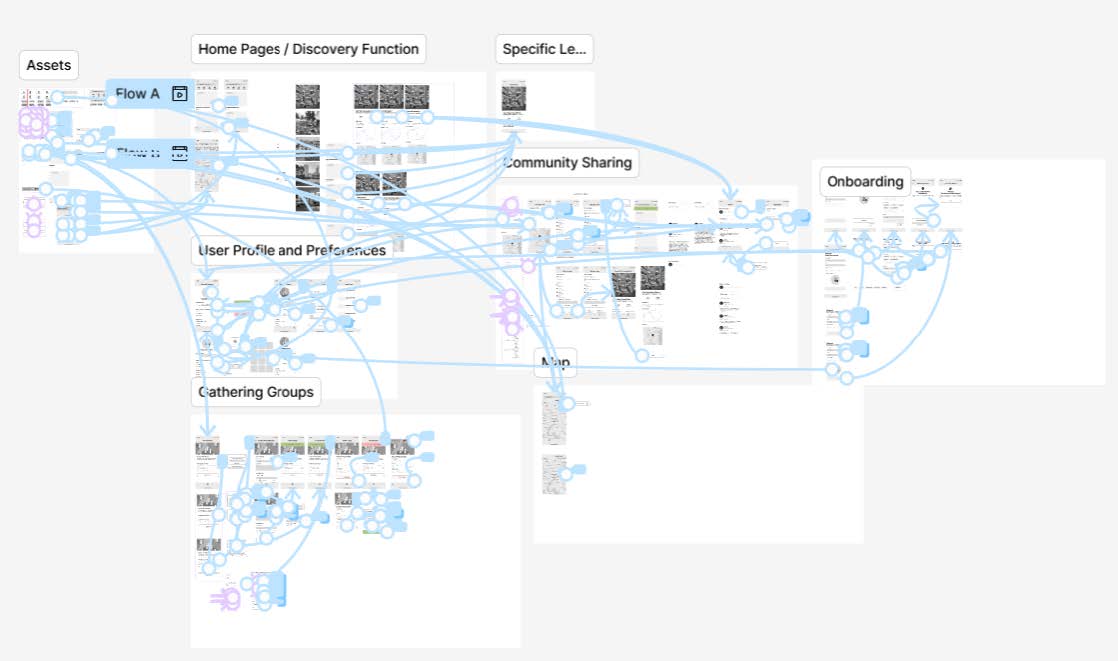
With a good understanding of our users, we went ahead and started on the prototyping. In total, we completed a low-fidelity (low-fi), high-fidelity (high-fi) and final prototype and at the end of each prototype phase, we conducted a user testing.
Low-Fi
We created our first low-fidelity (low-fi) prototype to conduct the initial functional test.
The goal was to ensure that users could easily access the main features of the application, along with supporting tasks like creating a user profile and forming groups. This allowed us to assess the app’s flow and user experience.
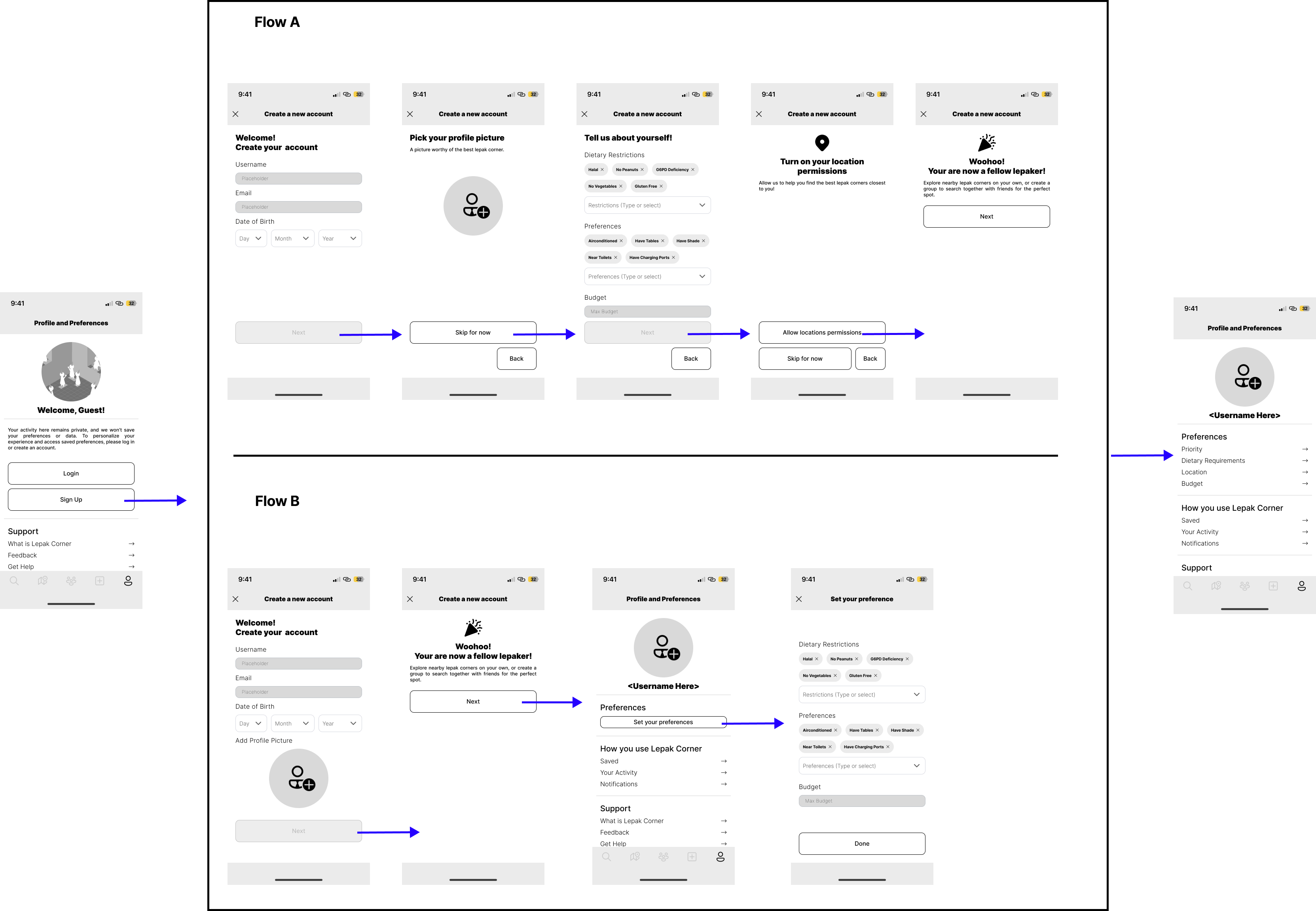
A/B Flows
A key aspect of our low-fi was the implementation of A/B flows.
We designed two distinct flows for 5 core features, enabling us to compare and analyze usability. This approach was crucial in identifying the methods that best suited our target users, ensuring the final design aligned with their preferences and enhanced overall usability.
Functional User Testing
The focused was on evaluating usability by exploring multiple navigation flows for 5 core features. Participants were divided into two groups, each following a counterbalanced sequence of Flow A → B or B → A for tasks. Key features tested included creating user profiles, managing Lepak groups, finding and creating Lepak Corners, and accessing saved locations.
High-Fi
After understanding user preferences through functional testing, we moved on to the high-fi prototype.
This high-fi prototype will be used in the high-fi usability testing and the goal is to present all features fully so that users can get a good feel of how the application will work.
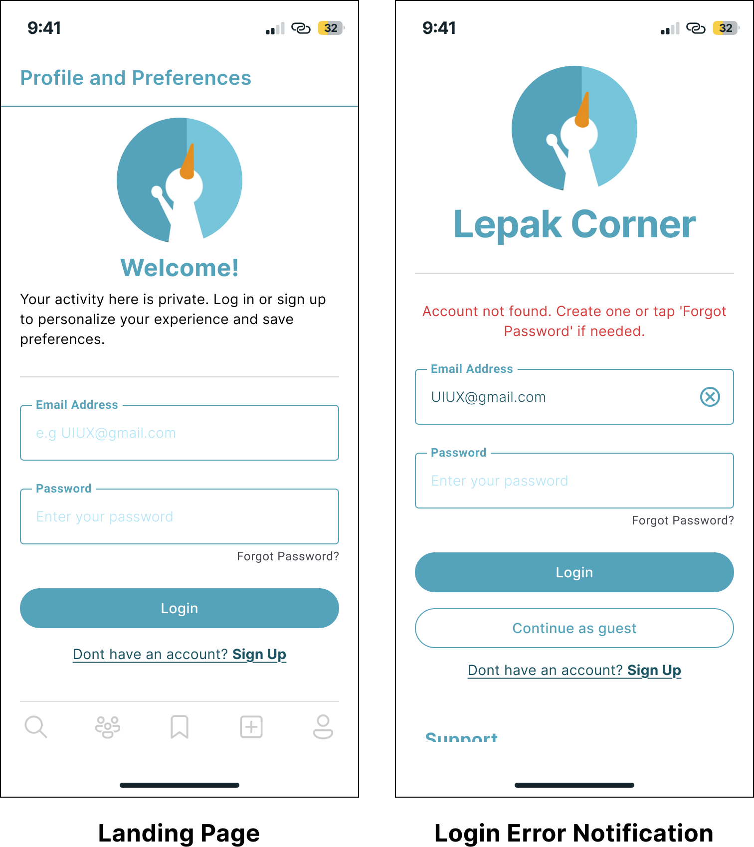
Design Principles
The high-fi prototype was designed following various design principles like Jakob Nielsen’s usability heuristics, such as Heuristic 9: Recognize, Diagnose, and Recover from Errors. For example, the prototype includes features for error recognition and recovery, such as identifying existing accounts and guiding users on recovery options.
Usability Testing
The second round of user testing for the high-fi prototype sought feedback on user experience to understand system usability. Testing was structured to evaluate functionality, navigation and improved user flow as well as screen layout and visuals. The insights gained from this test aided refinement for the final prototype.
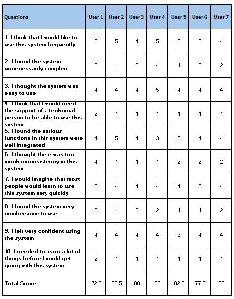
In this usability test, we employed the System Usability Scale (SUS) to evaluate the overall user experience and assess the ease of use of the system. SUS helped us gather quantitative data on user satisfaction and identify areas for improvement based on participants’ feedback.
Final Prototype
Finally, we were able to iterate on some flows and made several improvements. The majority of these were minor or quality of life changes that will enhance the usability of our system. A final user evaluation was then conducted to ensure everything is working as expected.
Conclusion
From this project, I gained valuable insights into designing intuitive and user-friendly systems. I particularly enjoyed learning and applying theories such as Jakob Nielsen’s Usability Heuristics, Gestalt Psychology Principles, and the System Usability Scale, and seeing their practical application in real-world design. Additionally, I honed my skills in Figma, which has been incredibly beneficial.